
Case Study
How I Designed SPF Mötesglädje: a Non-profit Case Study
A look at the design process behind SPF Mötesglädje. National app helping seniors combat loneliness.

Written by
Björn Rutholm

Some redesigns are about polish. This one wasn't.
When Infospread came to me in January 2025, their traveler app, MobiTime, was showing its age. It still worked, but it was a child of its time: a dated interface that didn't meet the accessibility rules public apps have to follow, or the standard people expect from something they use every day.
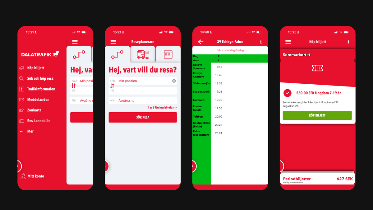
Infospread had felt the ground shift. They had been losing procurement to competitors, and the reason wasn't a mystery. The app no longer held up. The choice in front of them was honest and a little uncomfortable: keep patching the old app and hope, or take a proper fresh start. Either way, if they didn't act now, they risked having no real business left in a few years.
They chose the fresh start, and they chose to do it with someone whose job was to solve exactly this. That's worth pausing on, because it wasn't really a design decision. It was a business one. Patching would have meant fumbling in the dark, learning by doing. Bringing in a partner meant the problems could be solved quickly, properly and at once.
So we rebuilt MobiTime together. Not me handing over screens, but the two of us working closely, often on site, toward the same goal.
Accessibility itself wasn't the hard part. It's my field, and the requirements are a given for me. The real work was the combination.
A traveler app lives inside how people actually move: how we expect to search a journey, buy a ticket, and get going without having to think about it. At the same time it has to work as a business for the region, who administer the app and the commercial side from their own end. And all of it had to be wrapped in accessibility, usability and scalability, so the same product could roll out to one region after another, each under its own brand. Making the traveler's experience, the region's business, and a design that copies cleanly across all of them into one coherent thing, that is where the work actually was.
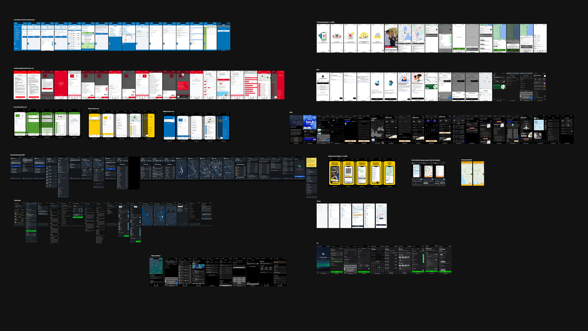
We looked at tons of different traveler apps, trains, busses, flights etc to understand the current market.
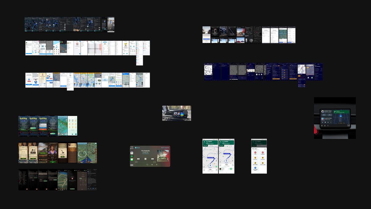
We also looked at other GPS based applications, navigation systems, games and other screens you interact with during travels.
That is what we built. Not a nicer version of the old app, but one product that a traveler finds easy, that a region can actually run its business on, and that the next region can pick up under its own brand without us starting over.
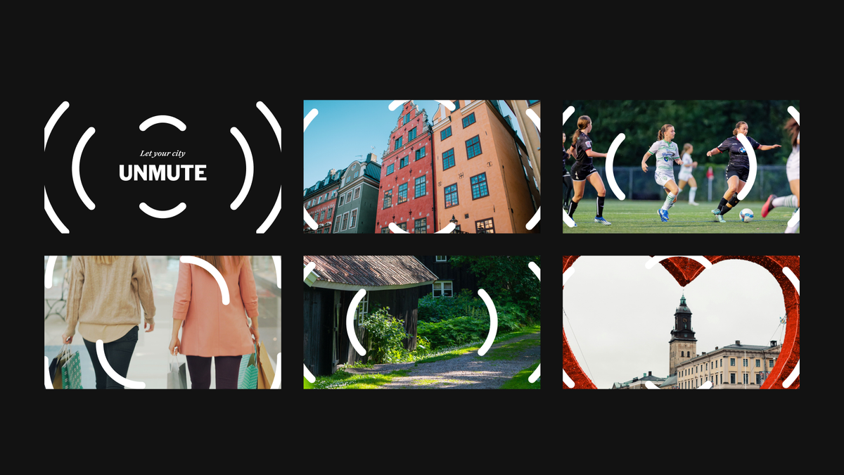
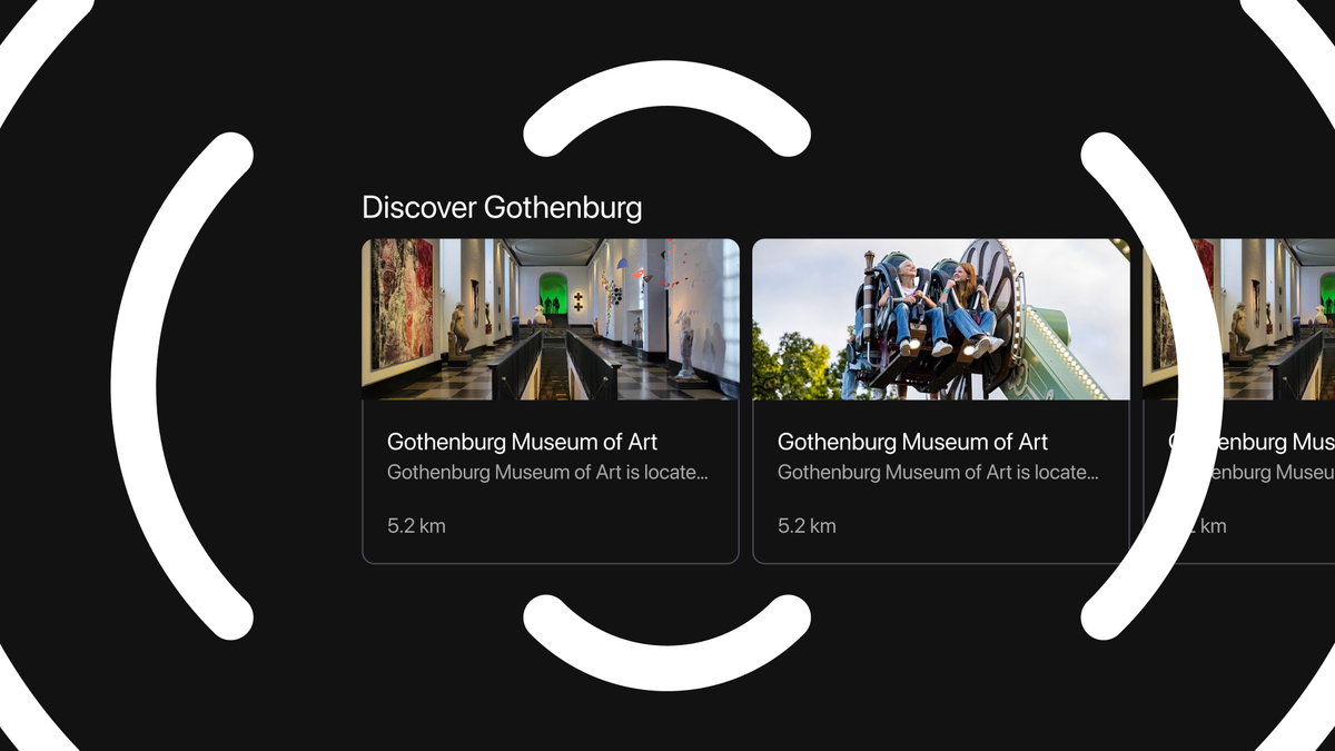
There was also an idea running underneath all of it, and it's the part I'm most fond of: let your city unmute. A traveler app isn't only a utility. What a region actually wants is for more people to leave the car and take the bus or the train, and you don't win that by being merely functional. You win it by making public transport easy, and genuinely nice to use. That gave the product a purpose beyond meeting requirements, and it turned out to be what a lot of regions connected with most.
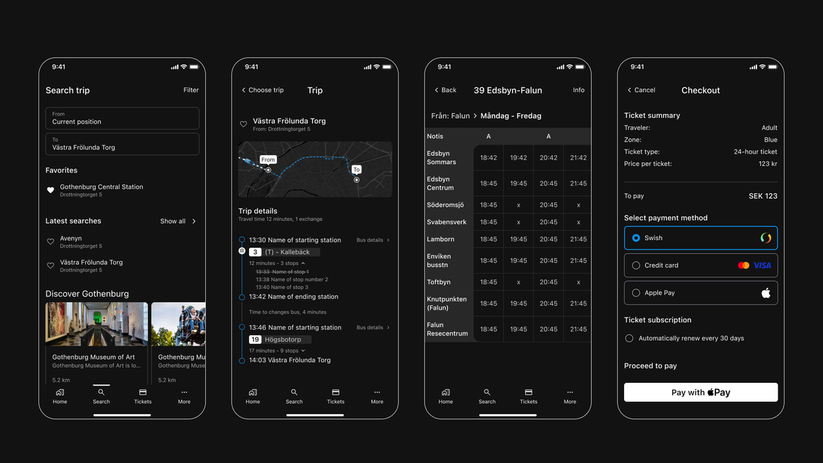
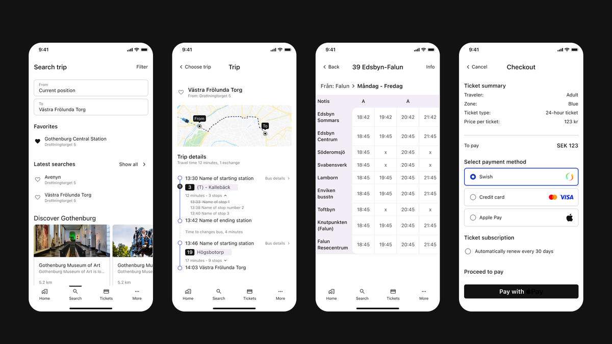
The clearest measure of whether it worked came from Infospread's own customers. Four regions that plan together, Halland, Jönköping, Kronoberg and Kalmar, ran a joint procurement for their traveler app. They had an incumbent supplier and an option to extend that contract, and they were unhappy enough that they chose not to use it. They went to the market instead, and they chose our app.
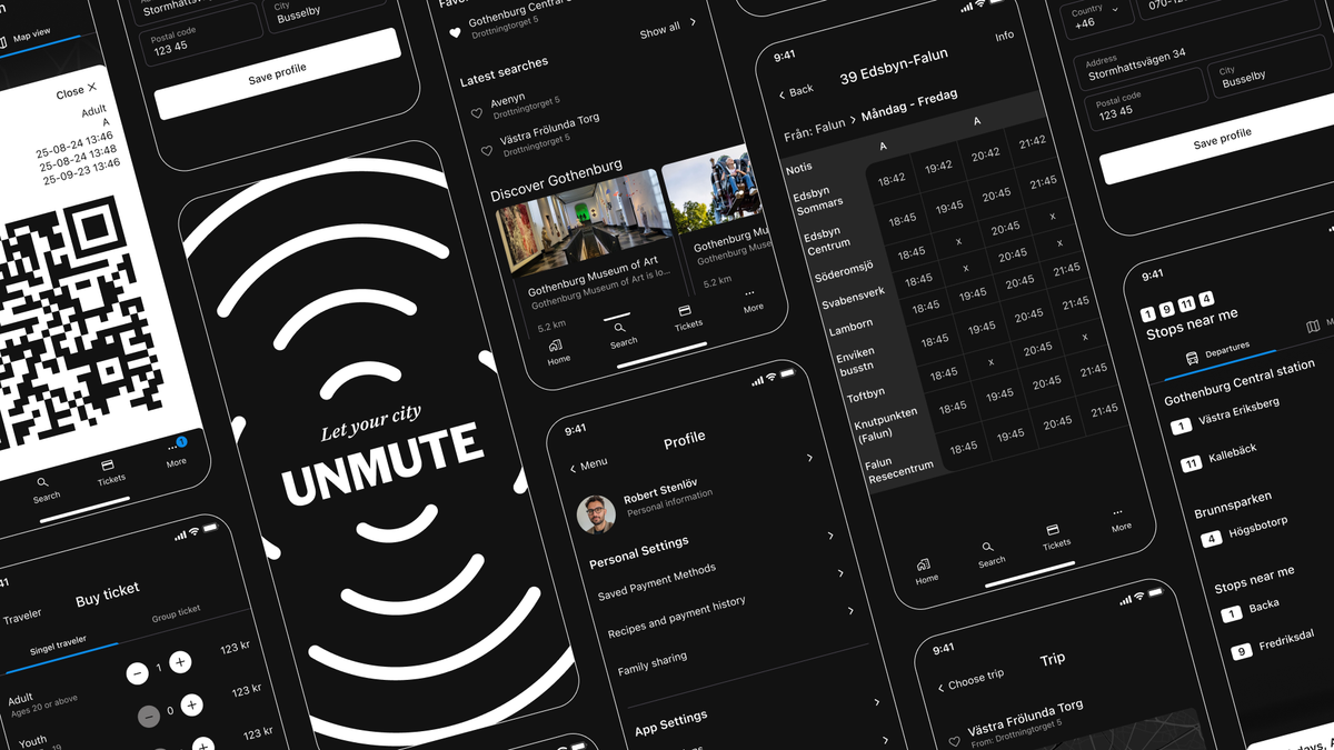
I want to be careful not to overclaim. A procurement is won on many things. But it's a good feeling to watch a client walk in with a product that holds up, a strong offer, and something that genuinely meets their customers' needs. That's the whole point.
If any of it is useful to carry into your own work, it's probably these three.
When a product stops meeting the bar, whether that's the law or just what people have come to expect, it isn't a design task to schedule for later. It's the business quietly walking out the door. Infospread felt that before they acted, and acting was the right call.
The value was never in any single piece. Not the interface on its own, not meeting the rules, not the business model. It was in getting the traveler's experience, the region's business, and a design that scales to line up as one thing. That is the hard part, and it's the part that actually mattered.
People don't commit to a feature list. What the regions connected with most wasn't a spec, it was the idea of what the app was for: getting a few more people out of the car and onto the bus. A clear purpose does more work than any feature.
The rest I'll just remember fondly: good chemistry, real trust, the same goal. That's usually when the work turns out well.
If you recognise that quiet feeling that a product has aged past the point of patching, that's usually the moment to act, not later. If you're there, I'm always glad to talk it through. No pitch, just a conversation.
Want to see the work?
View the full case study
Written by
Björn Rutholm
Founder of PixelPappa
Technical cofounder for hire. Product designer and developer helping teams build digital products that work.
A look at the design process behind SPF Mötesglädje. National app helping seniors combat loneliness.
You don't need months to find out if your idea works. Here's a step-by-step breakdown of the 5-day design sprint, and how it can save you from building the wrong thing.
Fonts are one of the foundations of an accessible reading experience. Here are seven things to look for when choosing a typeface, and a checklist to keep on your desk.
Insights, case studies, and updates from PixelPappa.